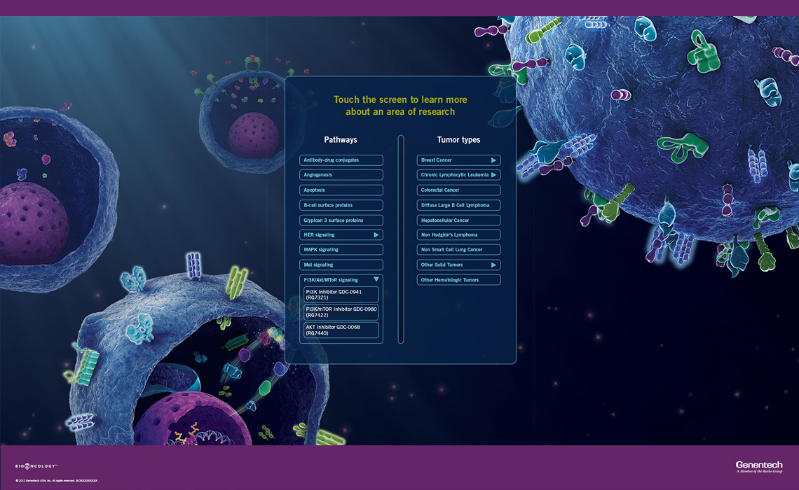
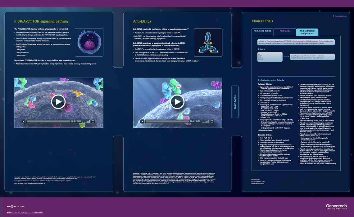
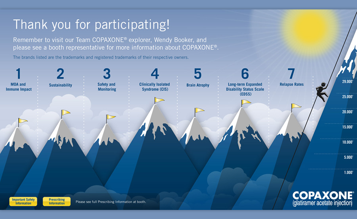
BioOncology Pipeline 3 panel kiosk with animated background
Role: UI design, UX.
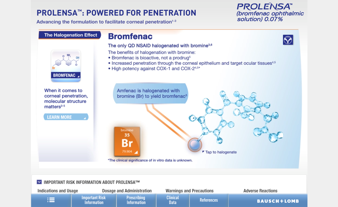
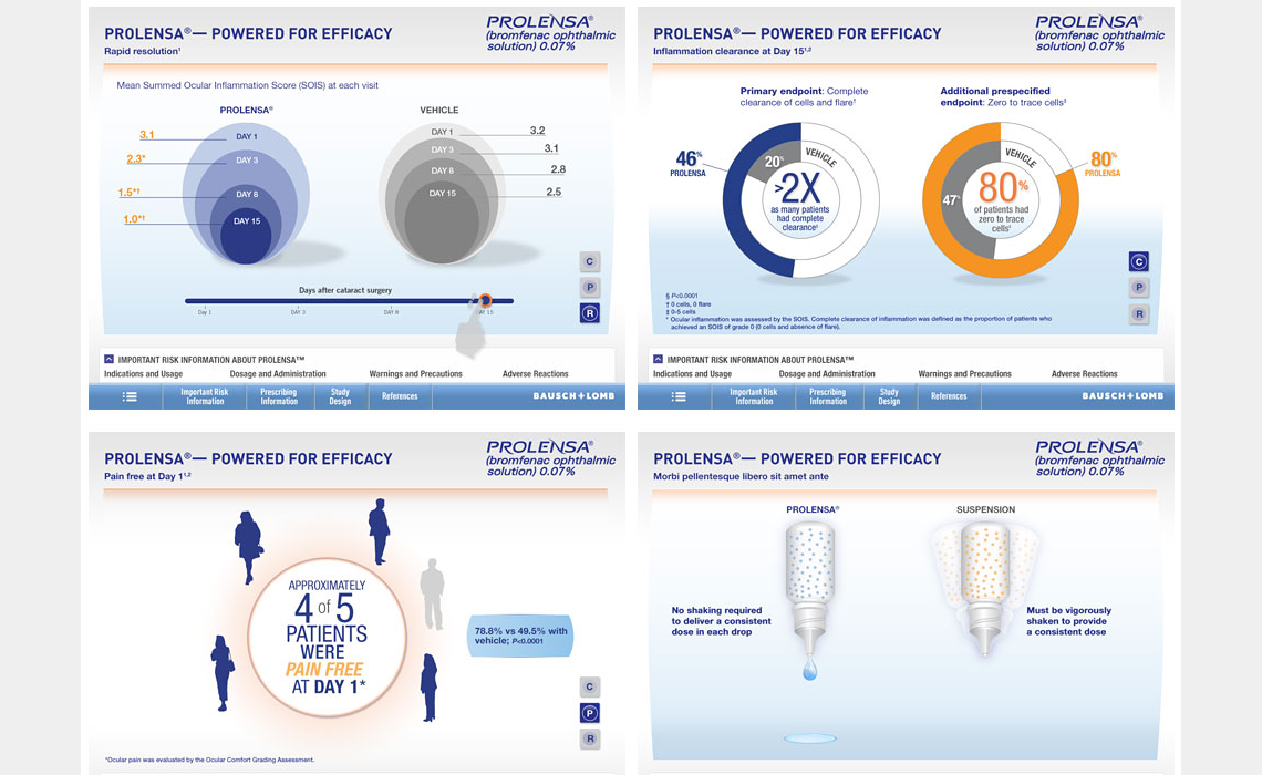
Problem: BioOncology has a yearly kiosk at their conferences for their annual Pipeline of drug lines. This year they were moving from a single panel to triple panel and greatly extending their product list while presenting a more comprehensive depth of information. The problem we identified was how to develop a navigation simple enough to not interfere with the overwhelming amount of information presented on the three large screens.
Solution: The goal was to make the panel have the ability to be one tap away from the information with minimal navigational elements.
Since we had the use of three large panels for the data, there was ample space to set up readable areas and have the right panel tabbed for deeper level of information. The user is always one tap away from main menu without an intrusive navigation at the top or bottom. The compelling attract loop encouraged people to explore. Due to the three panel design, more than one person was able to view the data unlike more vertical, single panel designs.
Outcome: The kiosk was heavily used at the conference to browse molecule types by physicians.
View the conference floor video and watch the participants using the panel.
Related Projects:
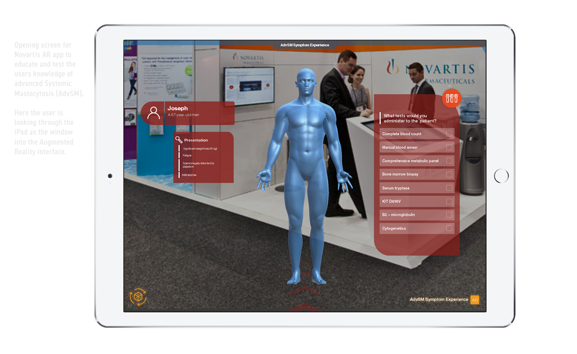
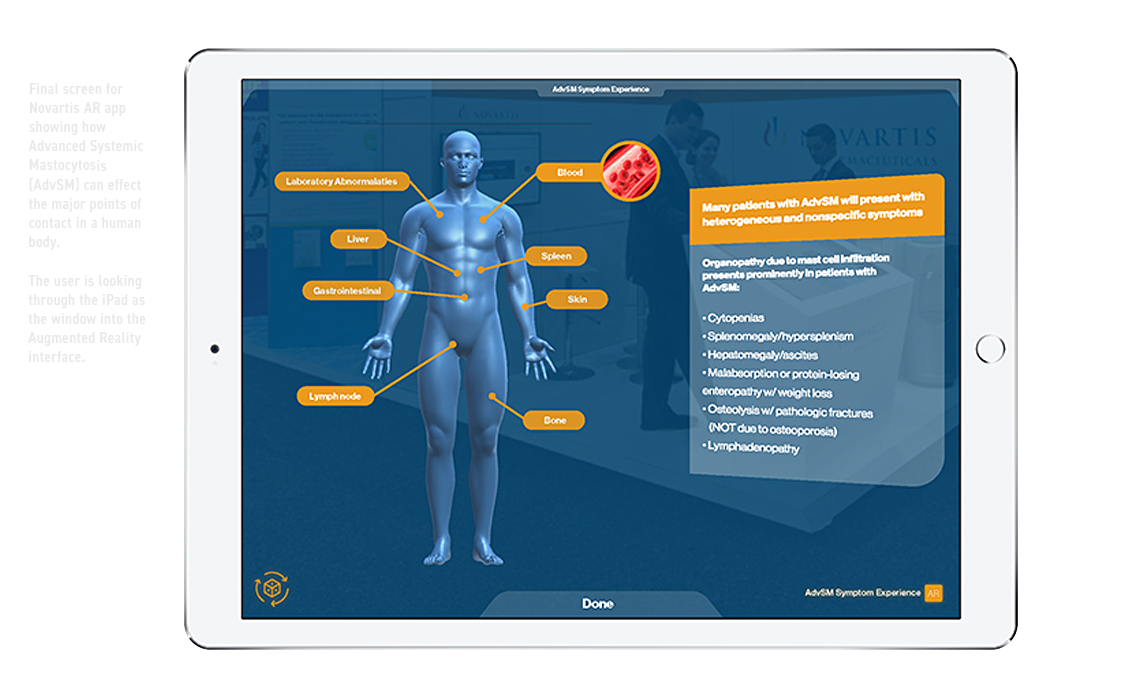
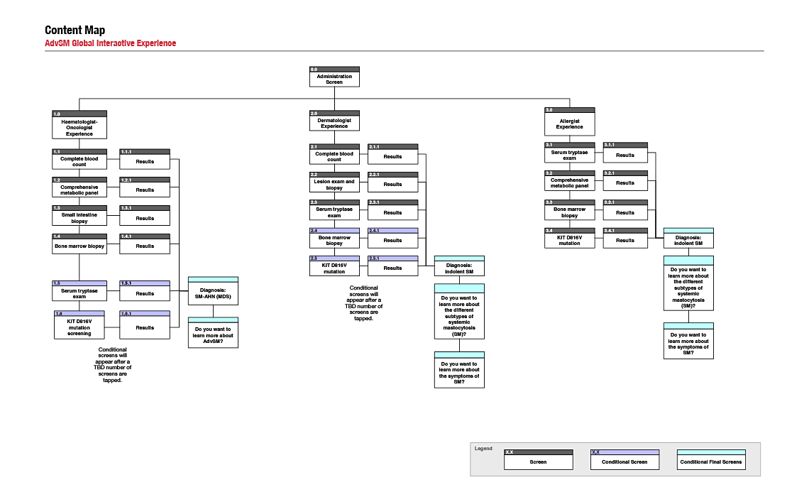
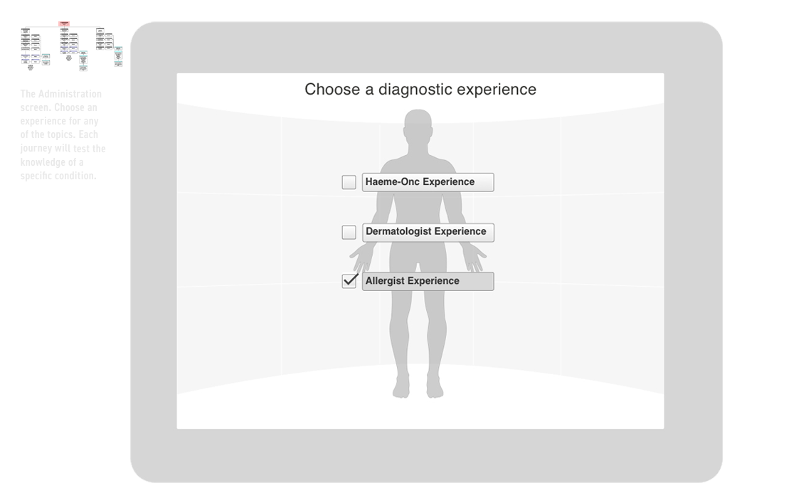
(AR) Augmented Reality iPad
>Conference Booth, Floor DisplayRole: UX ideation, wireframes, site map.
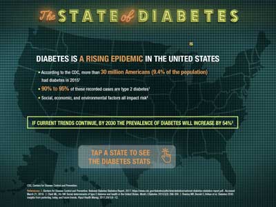
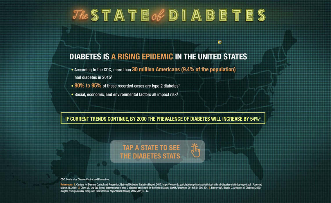
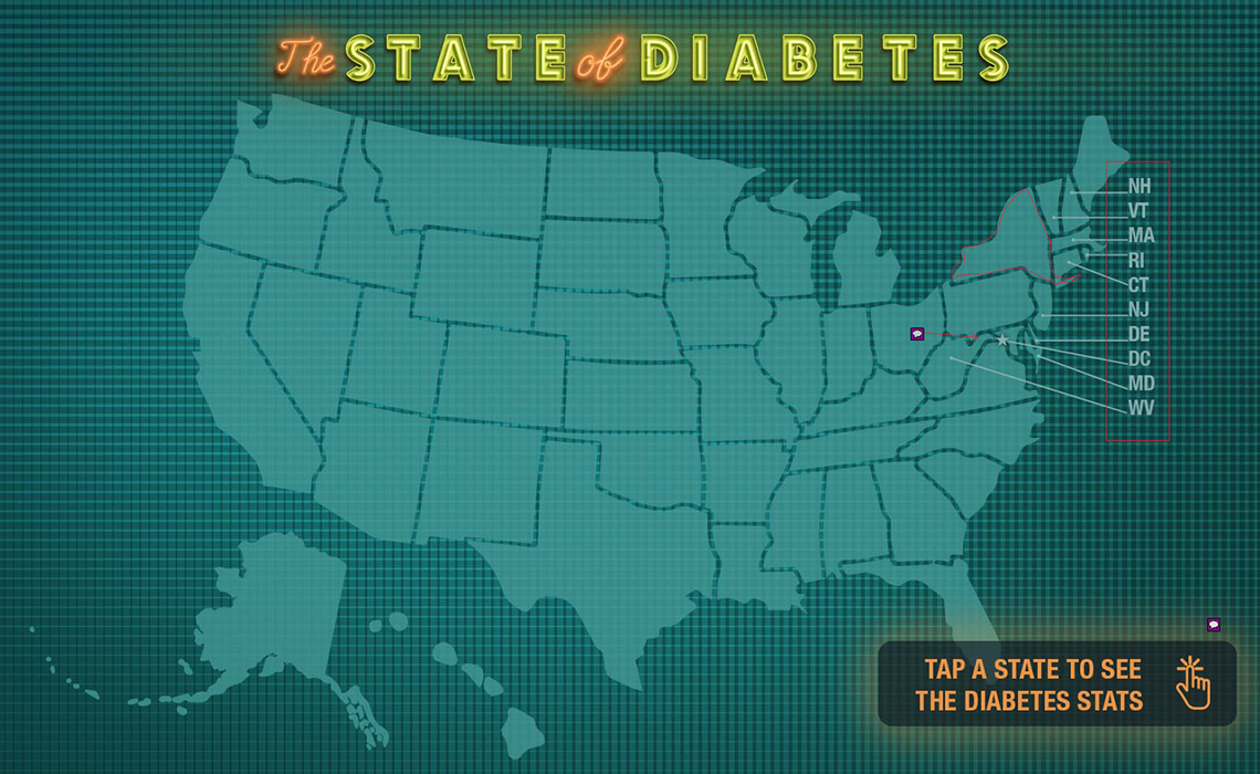
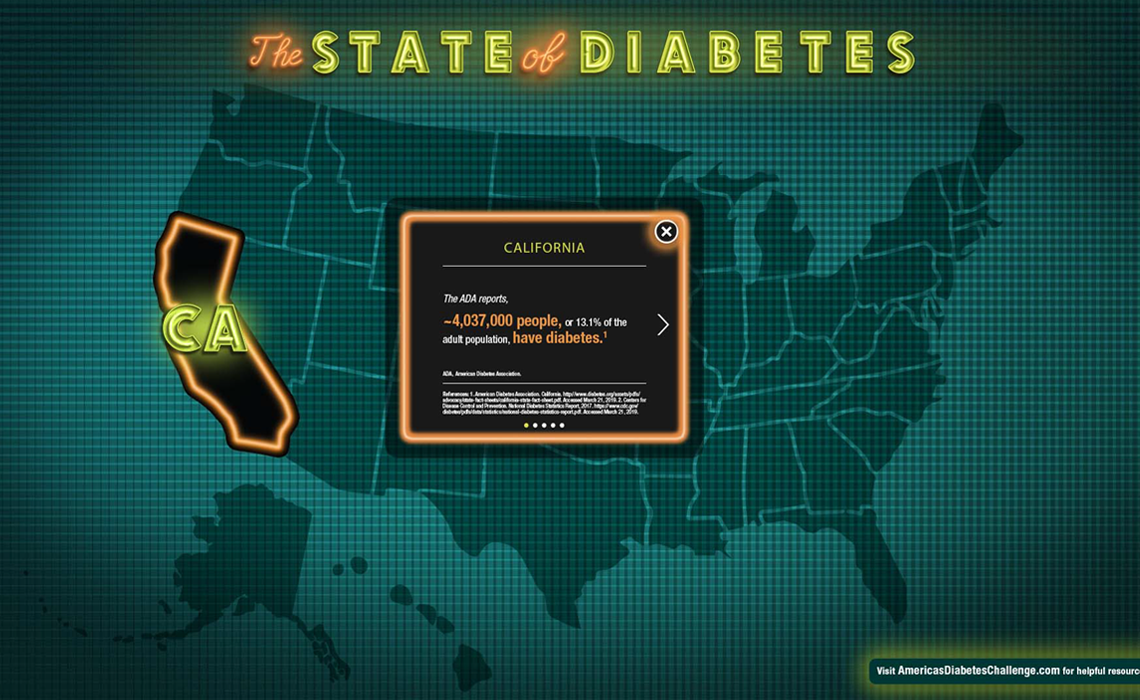
Diabetes Heatmap Touch screen
Role: UX ideation, wireframes, site map.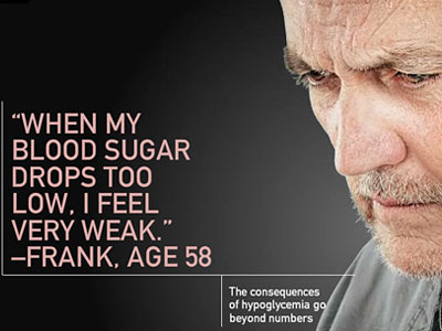
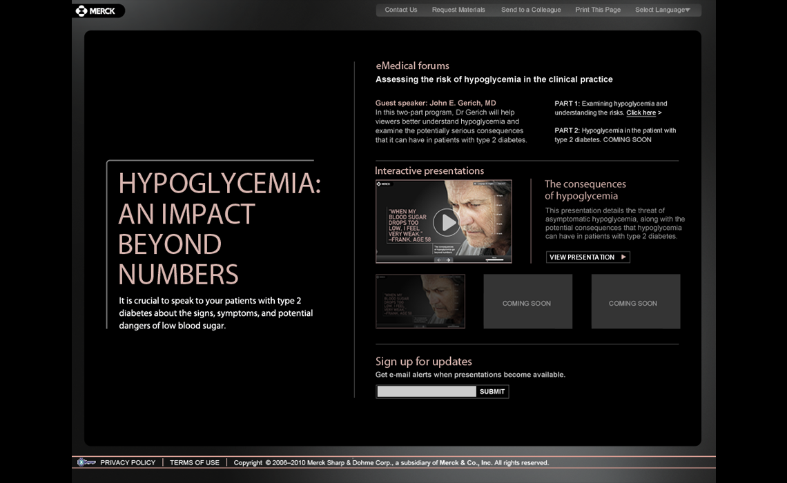
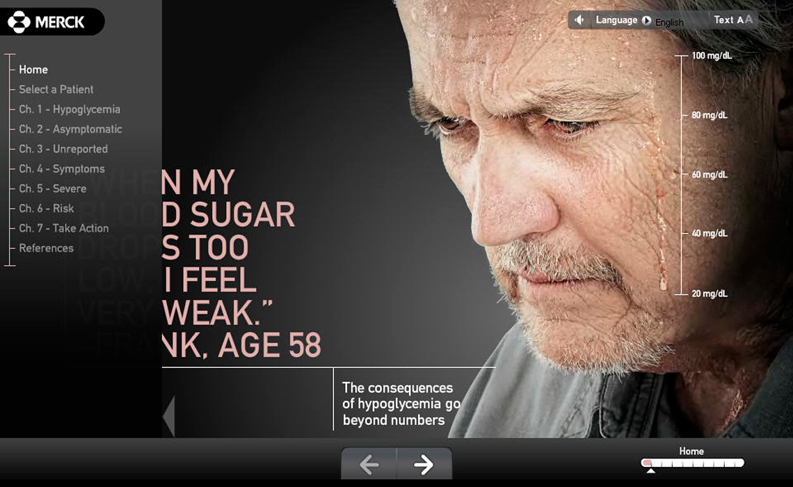
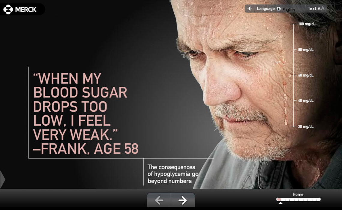
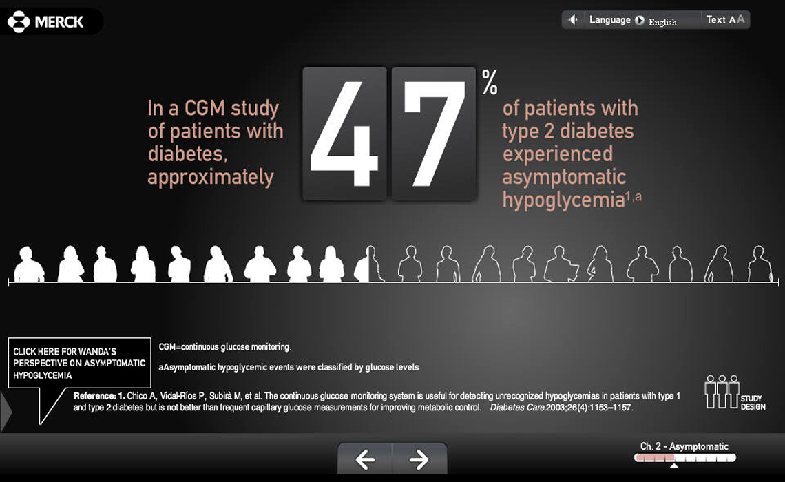
The impact of hypoglycemia
Interactive Presentation
Role: UX design, UI design
The impact of hypoglycemia
Interactive Presentation
Role: UX design, UI design

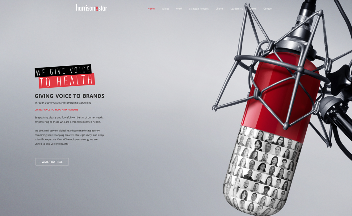
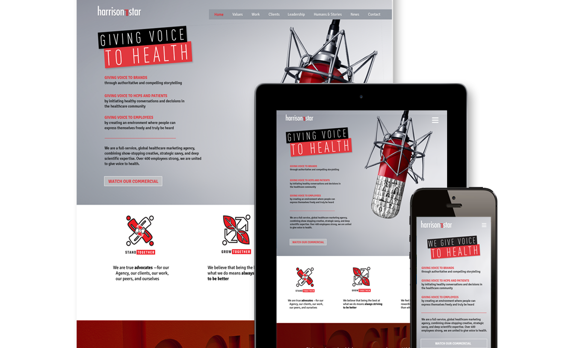
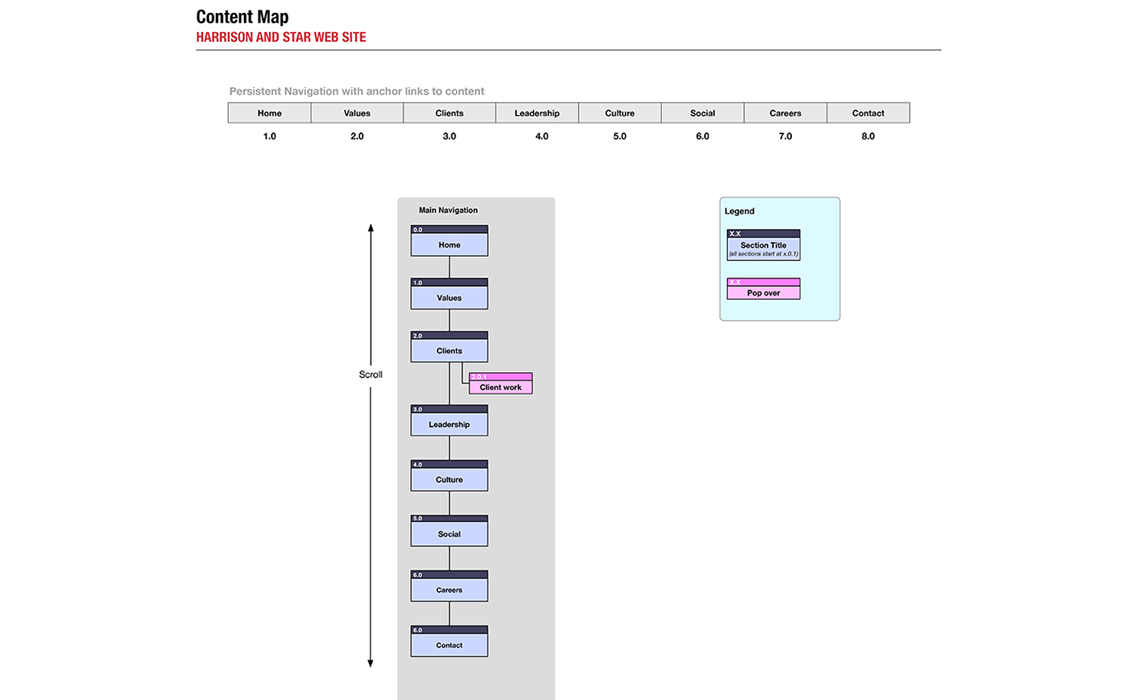
Harrison and Star web site
Role: UI design, AD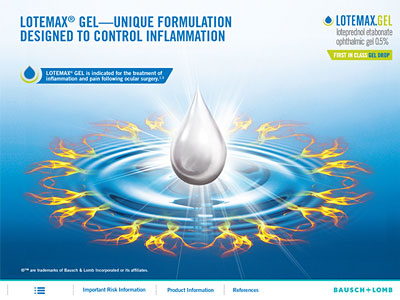
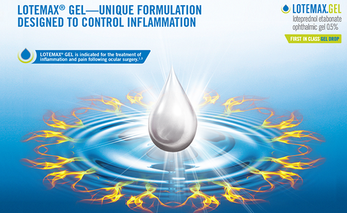
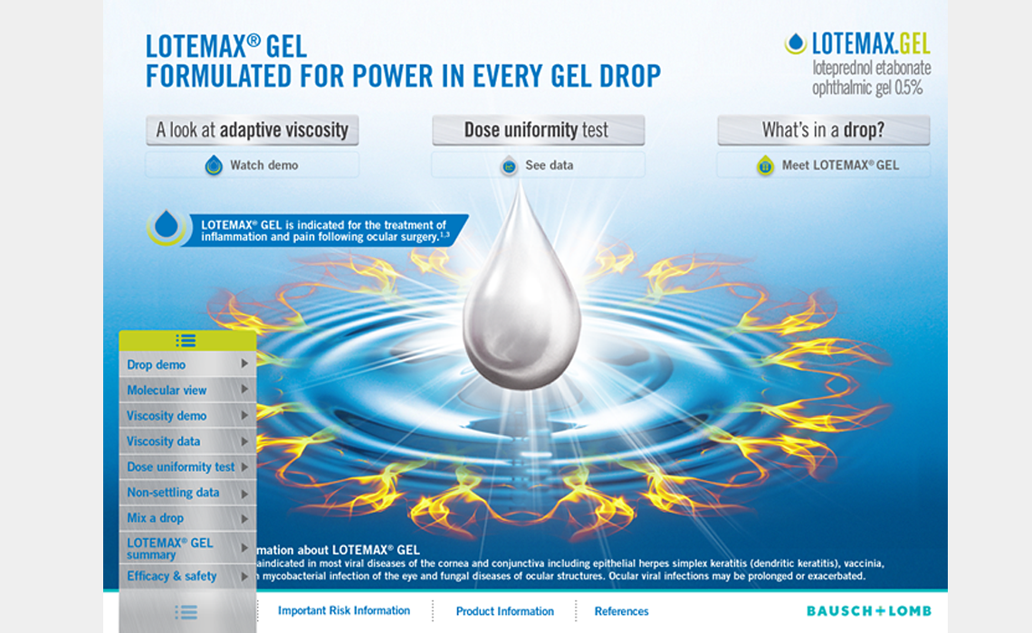
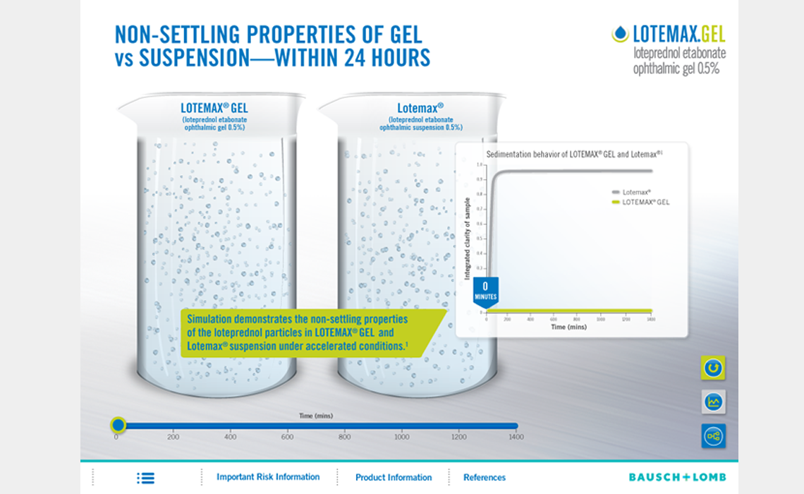
Lotemax Gel iPad, B&L
Role: UX ideation, AD & design, illustration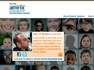
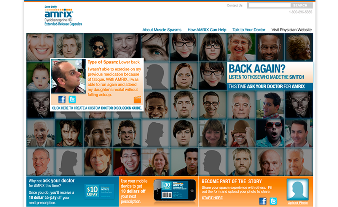
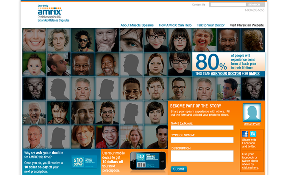
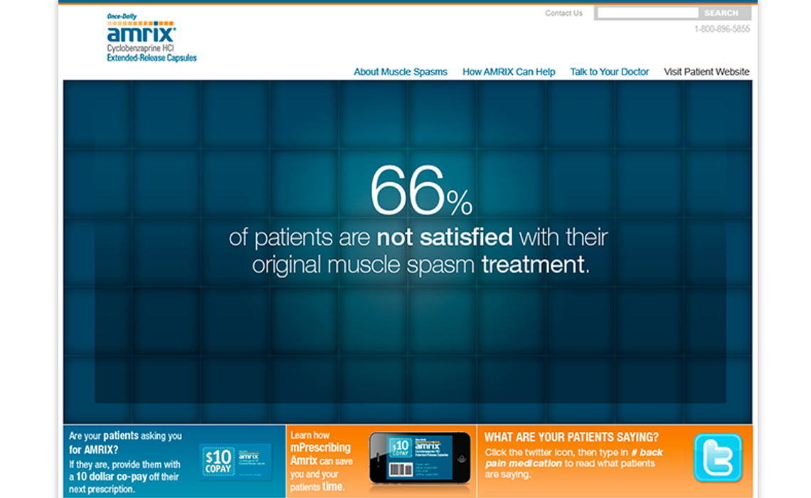
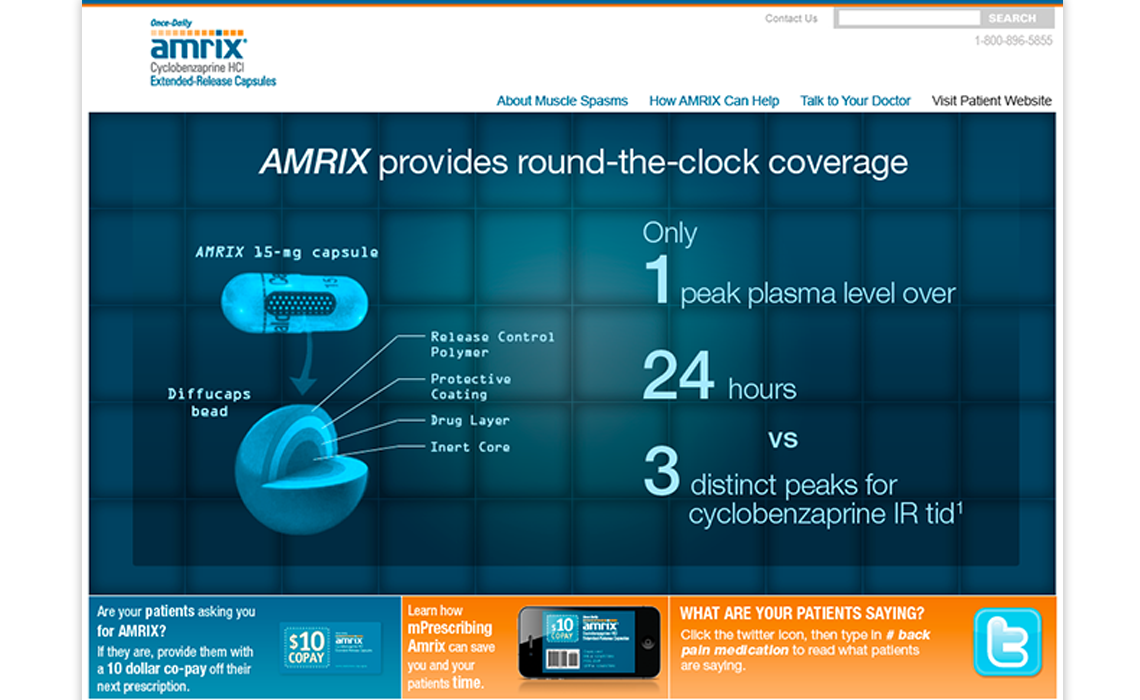
Pitch for Amrix
Role: UI design, AD